A classic, timeless home built for modern living, designed with natural materials that only get better with age. Here’s the full tour.
Building this house was a dream of mine. Normally, I'm working with clients, bringing their vision to life. With this one, the vision was mine from the very beginning. Every choice. Every detail. I'm so grateful I got to lean all the way into my own design style.
What I wanted was a classic, timeless home built for modern living, a house people could walk into and not know when it was built. I see so much of the opposite going up right now, builders playing into the trends, skimping on the materials that actually matter. I wanted to push back against that, with materials that get better with age, not worse: natural stone formed in the earth, brass that develops its own patina, reclaimed wood that has a story in it before we install it. And I was lucky enough to partner with a group of brands who believe in this the same way I do.
So much of what shaped this house came from where I grew up. My grandmother had a quarter horse farm, and my parents lived right around the corner. Both homes had a real livability; rustic, lived-in, clearly built for life on a farm, but both still had moments of pure beauty. My parents' kitchen had a butcher block island that everyone gathered around, surrounded by gorgeous art and Persian rugs. My grandmother's home wove antiques and floral upholstery into the most relaxed, inviting spaces. The mix-and-match of those opposing forces is exactly what I wanted to bring forward here.
Come walk through with me.
The Scout House
Let us show you around
01 The Foyer
Setting the tone
The foyer is the first impression of a home. And while this one isn't huge, it does exactly what a foyer needs to do.
The custom white oak front door, with reeded glass for privacy from the street, opens straight into the space. From there, your eye lands on pieces I'm honestly obsessed with: a substantial sideboard, a gorgeous gilded mirror, an alabaster lamp on a timer for ambient light at dusk. Beautiful and functional, both. But more than anything, I wanted you to walk in and feel an immediate exhale. Grounded.
What I love about this little room is that it has two opposing views pulling at you at once. Look one way, and the hallway draws you down toward the more intimate spaces - the primary, the office, the sunroom. Turn your head, and the next view is into the living room, the heart of the house. I love designing rooms that pull a person through to what's next. But for that to work, the foyer has to stand on its own, too.

That's the feeling that made me change the wallpaper two weeks before install. I had a soft stripe planned for months, and right at the end I called it - the room needed something heavier and moodier to carry the groundedness I was after. We landed on this neutral foliage pattern with little hints of green and blue threaded through it, and it was the exact thing the space needed.
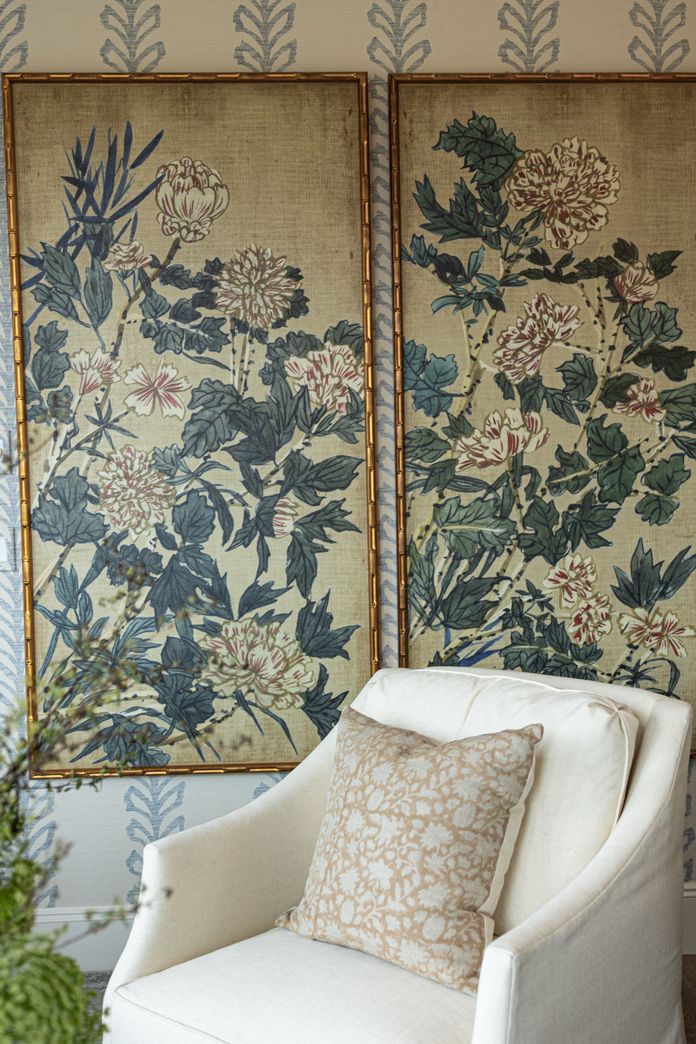
The four intaglio prints above the sideboard were also a last-minute addition. I love the fresh take on the color and the little bit of traditional flair they bring in. Together with the wallpaper, they set the tone for the rest of the house. Put together, but cozy and inviting. A little unexpected.


02 The Living Room
The room you actually live in
I wanted this room to feel inviting and welcoming, the kind of room you actually live in.

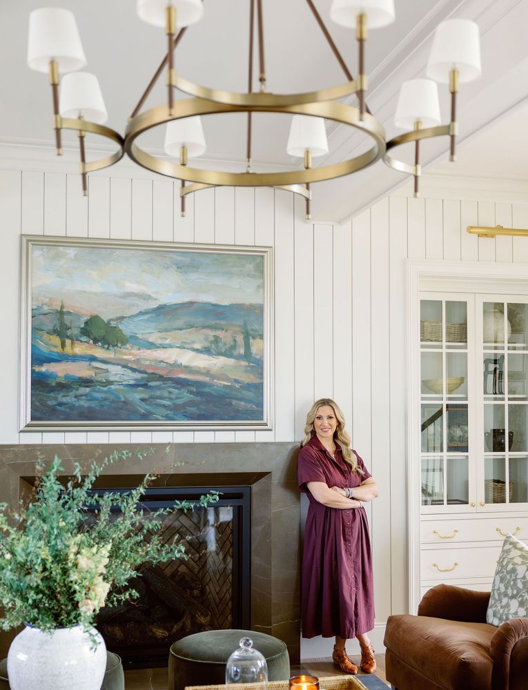
The art over the fireplace was my launch pad for the whole house. I saw it before I'd chosen anything else, and I fell in love on the spot. The greens, the blues, the dusty rose, the warm earth tones in the marble, every color in this house traces back to that one piece. It was the perfect color story for this entire home.


For the built-ins, I went smaller than what you'd see in most new builds, and that was intentional. Big floor-to-ceiling built-ins can feel intimidating to style, people start feeling like every shelf needs to be perfect. So I did a throwback to the niches you'd see in classic historical homes, with drawers on the bottom for storage and glass doors on top for display. It takes a lot of the pressure off.
I covered the walls in tongue and groove and layered in beautiful millwork, which gives the room real architectural depth. But with all those traditional notes, I knew the fireplace itself needed to push the other direction, something more modern, with cleaner lines. A substantial marble surround with clean mitered corners gave me exactly the juxtaposition I needed. Without it, this room would have leaned too far traditional.


03 The Kitchen
The three-zone kitchen
I'm obsessed with this kitchen. I just want you to know that going in.
The kitchen is the heart of the home - that's always been true. But it's also the hardest-working area of the house, and you have to design it for both jobs. So we did a three-zone kitchen.


Zone one: the cooking and prep zone. The island runs eleven feet; sink, dishwasher, and trash all anchored on it with the range right behind. This is where you prep and if it’s like my home, where you gather a crowd.
Zone two: the side kitchen, tucked beside the fridge. A second sink, a second dishwasher, a wall of windows behind it. This is where I imagine prep happening and where the kids come in to grab water without being right in the middle of cooking. It's the second kitchen that makes the first one work.
Zone three: the scullery, just off the back. Refrigerator drawers, ice maker, microwave, and a Costco door straight to the garage. (More on that in a minute.)
Three zones, nobody crowded, nothing too far away. People look at this floor plan and tell me the fridge is too far from the range, and I think they overthink it. When you're standing at the island, the fridge is right there, and honestly, my actual workflow rarely calls for going from fridge to stove in one motion. What this layout really gives you is room. When everyone naturally drifts into the kitchen the way they always do, nobody's bumping into the cook, nobody's getting in the way. People can actually gather and hang out in the heart of the home, which is what a kitchen is supposed to be for in the first place.


A few details worth knowing about. The countertops are Taj Mahal quartzite. I think of natural stone as art, it's literally formed in the earth, every piece is completely unique, and it wears so well over time. We did a creamy white kitchen with a dark-stained island for contrast. We have double dishwashers, because if you're entertaining, you don't want a sink full of dirty dishes. We have pullouts on either side of the range for canisters and spices. Two towers on either end of the hood for plates. A paper-towel pullout, so you're not setting a paper-towel holder out on the island. Bells and whistles, all of them earned.
04 The Scullery
The hardest-working pretty room
Right off the kitchen, the scullery does a ton in a small footprint. Two refrigerator drawers from True Caliber. An ice maker. The microwave. Pantry storage on a U-shape so everything is within reach when you turn around. And the Costco door, which I love - you pull up in the garage, open the door, and unload your trunk straight into the pantry. It doesn't have to be huge to be heavy-hitting.
Because this room gets so much light, I went bold and intentional with a pop of color. I matched the cabinetry to True Caliber's olive finish and fittingly enough, brought in an organic olive wallpaper to complete the moment. The print is small-scale and a little nostalgic, just enough to feel interesting without overwhelming the room. Personality, even in functional .
This is the room that proves every square inch can do something for you.


05 The Dining Room
One dining room, used
This house has one dining room. Just one. And it's inside the kitchen.
I'm just of the belief that you should use every square inch of your house. Formal dining rooms — we've all seen them. They sit unused for fifty weeks of the year and slowly turn into the room where the Amazon boxes pile up. I designed this house for a family that's actually going to live in it.
So this room had to do both jobs. Casual enough for a Tuesday breakfast. Polished enough for a real dinner party. We carried the vertical tongue-and-groove and the reclaimed beams from the kitchen straight through. We hung a Visual Comfort chandelier. We did a substantial nine-foot table — long enough to actually gather people around — and mixed the dining chairs with two end chairs that are slightly different. Everything is high performance, because I wanted it to be really livable. But if they're hosting a nicer dinner, I want them to feel like they're not just eating in the kitchen.
Here's the trade-off worth naming, because it shows up everywhere in this house: losing the formal dining room is what gave us the sunroom and the pocket office. We didn't add square footage. We just refused to spend it on a room that wasn't going to get used.
"Your house should be used for how you live life, not what you feel you need to make it a home."


06 Hallway & Powder Bath
A statement on its own
The hallway draws you deeper into the house. Reclaimed beams overhead. Floor-to-ceiling windows down one side. Visual Comfort lanterns running the whole length, with a beautiful Loloi runner underneath. I didn't want it to be just a hallway. We kicked up the design with the fixtures and the runner, and now it's a statement on its own.
Then you open the powder bath door, and it hits you.


In a powder bath, you might as well pack a punch. It's a small space to make a statement, and it's the room every guest uses, alone, with their full attention. So why not go for it? I wanted something unexpected. We did a Schumacher mural - tapestry-feel, romantic, a little botanical, soft and neutral but visually loud on the wall. Because the mural was so neutral, I knew we could go crazy with the stone. So we paired it with viola marble — exotic, dramatic, equally as eye-catching. Those two are the stars of the room.

The plumbing is unlacquered House of Rohl brass that's going to patina, darken, and age into the room over the years. That brass is doing exactly the work I want it to do. It's making a new build feel old.


07 Primary Bedroom & Bath
A hot take, and a retreat
I have a hot take on primary bedrooms: most of them are too big.
In all the years I've been doing this, most clients tell me the same thing. I sleep in here. I get ready in here. I'm not lounging in here. I'm not reading a book in here unless it's in bed. So why are we sizing it for the photo? In most houses I see, the primary is built for a corner chair that nobody sits in because it's holding yesterday's laundry. I would rather have a decent-sized bedroom and put the bells and whistles in the bathroom.

The trade gave us his and her vanities. Two separate closets. A private water closet. A linen cabinet. A freestanding tub. A massive shower. Every one of those things gets used every day.
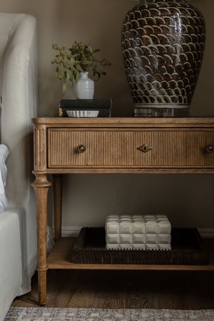
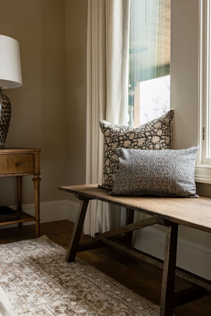
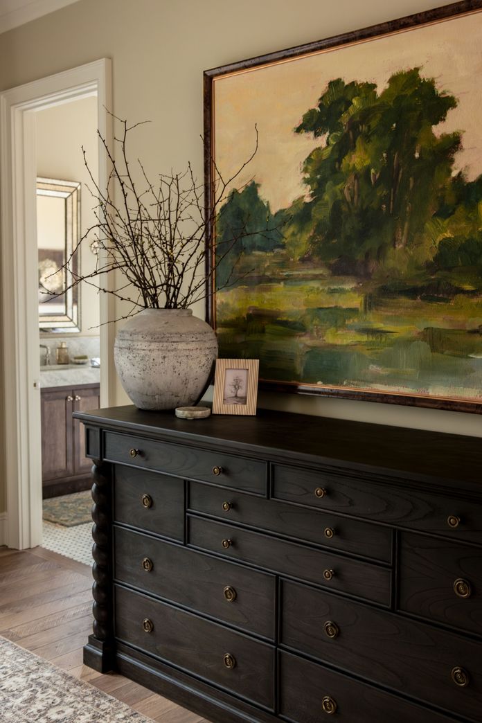
In the bedroom itself, I wanted it to feel like a retreat. A real breath at the end of the day. So I went neutral and calming, and I let the layers do the work. Soft, layered bedding. Substantial Gabby nightstands with so much attention to detail — the kind of pieces you'd pass down. A slipcovered upholstered headboard. When the palette stays quiet, every texture has room to be felt.
The fun detail: the woven baskets above the headboard. We added them at the last minute, the night before we shot. The texture they brought is honestly the thing that pulled the whole room together.


08 Pocket Office
The family command center
The catch-all command center used to live in a corner of every kitchen. Then we got dedicated home offices, sized like extra bedrooms, used by one person, sometimes.
The pocket office is the modern answer. Big enough for someone to actually work from. Big enough for a parent to help a kid with homework. Big enough for two people to share without being on top of each other.
It's a small room, and we chose to take it up. We did a flat vault to the ceiling — not a true vault, because that almost makes a small room feel taller and narrower at the same time. So we flattened the vault, did tongue-and-groove on the ceiling, and painted it the same color as the trim. Then I intentionally did not take the cabinetry up the wall. We kept it at base level so the eye keeps climbing. Window treatments hung outside the frame on the drywall, so the small window reads bigger.
And — because I wanted this to be a moment — we put in a 32-inch-wide basket chandelier. Bold for the room, on purpose.
It's small and it's heavy-hitting. Honestly, you'll use it more than any office I've ever designed.


09 Sunroom
A room without a TV
This is one of the rooms we wouldn't have if we'd kept the formal dining.
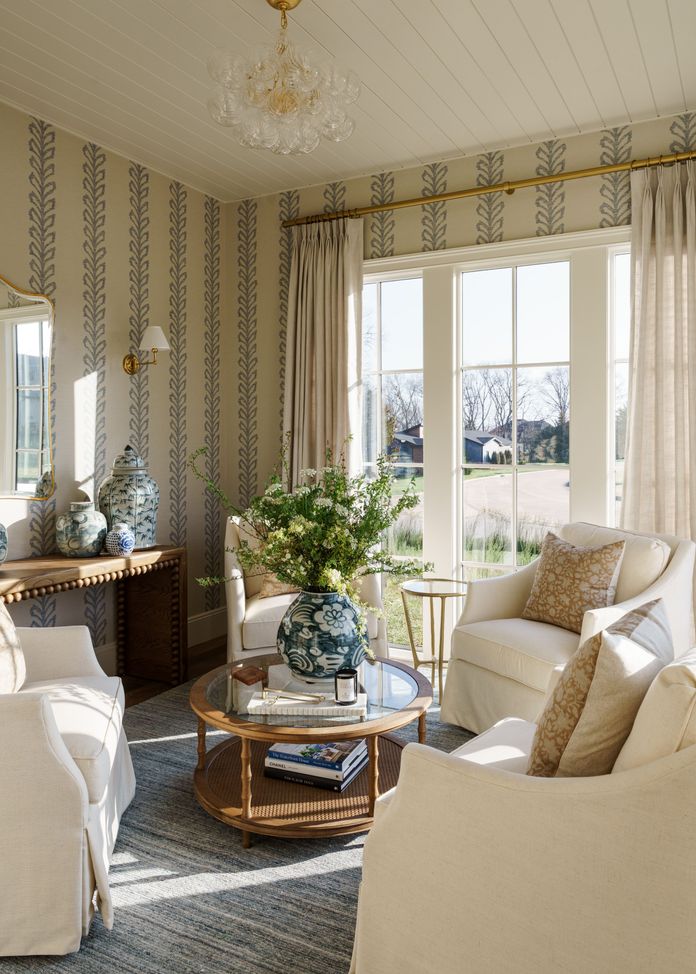
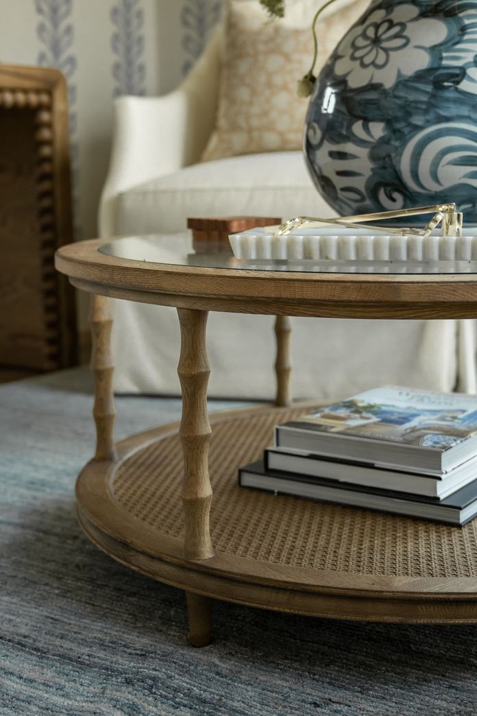
It's the room I dreamed about as a kid. Floor-to-ceiling windows on three sides. A bubble chandelier overhead. Soft blue-and-white striped wallpaper that won't look dated in twenty years. And — a fun detail — four swivel gliders around the coffee table, instead of a sofa or chairs in a row.
What I really wanted in here was a room without a TV. Every room in a modern house is organized around a screen, and what gets lost is the room you escape to and unplug. This is the room for coffee in the morning. For a book on a Sunday. For a glass of wine at the end of the day, or a real conversation with a friend.
It's a place you could sit for hours.

10 Patio
An extension of the living room
The patio is a true extension of the living room and a lot of that comes down to the Marvin sliders. Sliding doors get a really bad rap, but I love them. The functionality is so much better than what people give them credit for, especially when you're thinking about how a room actually flows. A swinging French door eats into your furniture layout, interrupts traffic, gets in its own way. Sliders just disappear when you open them. The living room and the patio become one space.
We added Bromic heaters overhead so this patio can be used well into the chilly months — which here in Missouri matters. We're outside on this patio for a lot longer than the calendar would suggest.
And the view out the back is honestly stunning. There's a reason we wanted the doors to disappear.
11 Exterior
The 5-year question
I fell in love with this floor plan from Frusterio for everything you can see in the photo — the curb appeal is incredible, and the architecture really puts the emphasis where I wanted it: on the windows, and on the single arched front door. (Most builders default to a double door. I love a single, done well — it feels more intentional, more historical, more confident.) Marvin brought all of those windows to life.
For the exterior itself, I knew I wanted full stone with pops of siding. I fell in love with Cottage Gold from Earthworks — the brown undertone just felt historical and classic, like the house had already been there. It paired perfectly with rich espresso from James Hardie, which gives the siding the depth I was after without competing with the stone.
But the most useful thing I can share about this exterior has nothing to do with materials.
Building a home is a constant exercise in knowing when to fight for the details and knowing when to give in. The original plan called for a side-facing garage. I love a side-facing garage. I fought really hard for it. Then the bid came back for the retaining wall it was going to require, and the number was thirty thousand dollars.
I sat with that for a while. Then I asked myself the question I ask my clients all the time: in five years, am I ever going to think about this again?
Honestly, no. So I let it go. I'd rather have that thirty thousand inside the house — better materials, better trim, the unlacquered brass in the powder bath that will patina over the next twenty years.
I had to get over my ego on it. But every house decision is some version of that conversation. You have to fight hard for the things that matter, and you have to know when to walk away — especially when the budget is on the line.


In Closing
When I think about wrapping this house up — handing it off, locking the door behind me — I just keep coming back to how proud I am of it.
I'm proud I got to do this project. I'm proud of the care and craftsmanship that went into this house. And I'm proud of what this house gets to show — that balance of traditional and rustic and polished and lived-in that I grew up around, brought into a home that's built for a modern family.
This house will always hold a really special place in my heart. More than anything, I hope you feel something walking through it. And I hope it inspires you to go try something in your own home.
For a Tuesday morning twenty years from now, when somebody is making coffee in this kitchen, and the marble is a little softer, and the brass has gone deeper, and the house has aged exactly the way I hoped.
A house that will stand the test of time.

Our Partners on the Scout House
Design by Jesse Bodine | Architectural Photography Matthew Anderson | Lifestyle Photography Sammie Ploch | Product Photography Anna Hennessey | Floral Styling Sarah White
Get full access to all the Scout House details
The full source list — every paint color, every textile, every piece — is on its way. We're going room by room with deep dives over the coming months. Drop your email below and we'll send you the sources the moment they're ready, plus the first room deep dive when it lands.
Comments
Comment or question? Leave it below.
Diameter, clearance, and the base you choose decide how many people actually fit around a round table. Here are the numbers our designers use, and the tables we'd recommend to every client.
keep reading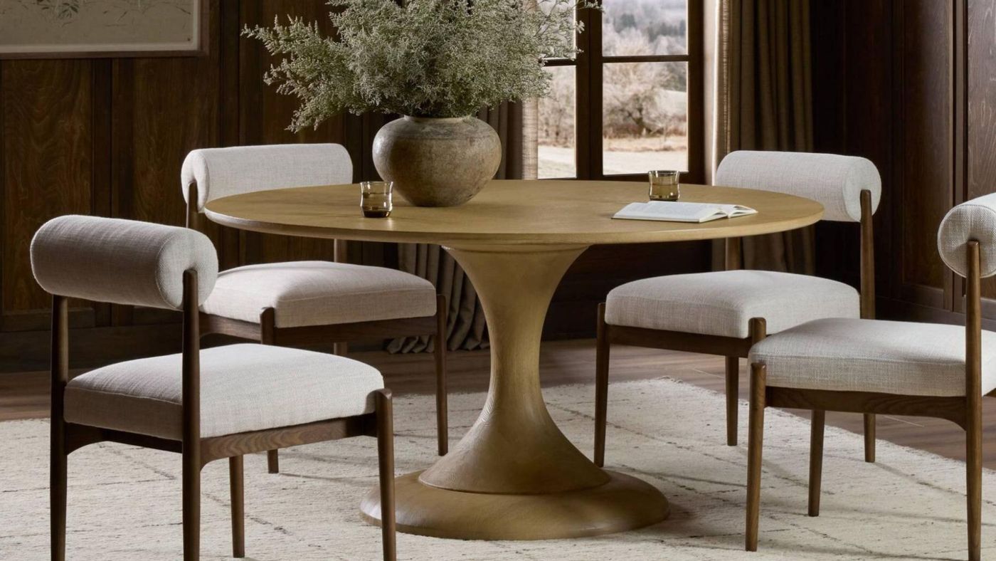
Jesse put True Caliber refrigeration in the Scout House and color matched the cabinets to it. Why she showed the appliance instead of hiding it.
keep reading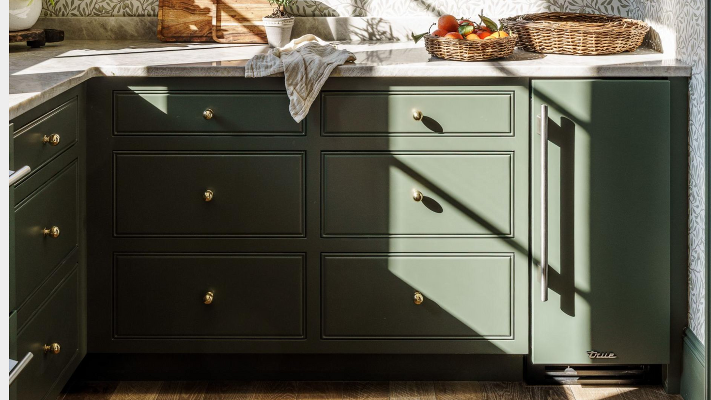
You can put a clean-lined sofa next to your grandmother's carved chest. Here is how I actually do it, including what to do about the matching set that is already sitting in your bedroom.
keep reading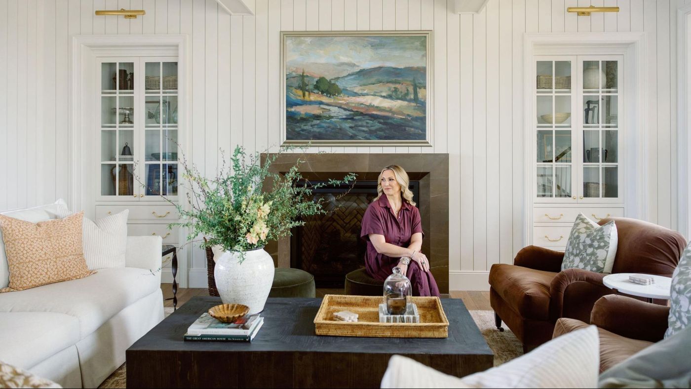
The kitchen is divided into three working zones, with the dining table right in the middle and the scullery at the end intentionally left open. Nothing is closed off from the rest of the space. Here’s the thinking behind each of those decisions.
keep reading
Three completely different purchases go by the same name. Here's how I sort them, and what I'd buy for each.
keep reading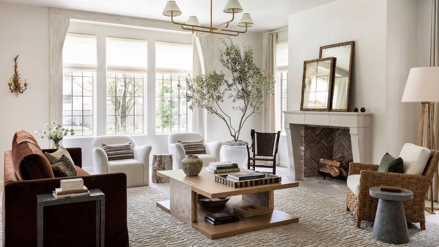
Diameter, clearance, and the base you choose decide how many people actually fit around a round table. Here are the numbers our designers use, and the tables we'd recommend to every client.
keep readingJesse put True Caliber refrigeration in the Scout House and color matched the cabinets to it. Why she showed the appliance instead of hiding it.
keep reading